The Decline of the West and the Rise of the Global South

In my previous blog post, I argued that with the rapid economic growth of India and China, we are heading toward a tri-polar global order by around 2050, in which their combined economic weight will rival that of the United States. However, I now realize that the numerical evidence I cited back then was rather weak. While discussing this with ChatGPT, it suggested I take a look at Piketty. So I began reading his Capital in the Twenty-First Century, and I was immediately struck by its rigorous and comprehensive treatment of income and wealth data. It’s absolutely fascinating.
I studied economics at university and seriously considered becoming an academic economist. What held me back was that, around 1990, economics was dominated by abstract mathematical models, which often felt disconnected from real-world problems. It turns out that Piketty is roughly my age, and as I discovered, he too studied economics during the same period and wrestled with similar doubts. But unlike me, he took the empirical route—gathering historical data on income and wealth to study economics through the lens of evidence. I’ve also long had a strong desire to "see the data," which led me to study accounting and even dabble in data science.
I’ve only read about 10% of Piketty’s book so far, but it's so absorbing that I’m deliberately reading it slowly, savoring each section. In fact, I think that’s the best way to approach it—as a kind of university textbook to be read over a few months, with ample time for reflection.
Before diving deeper into Piketty’s arguments, I want to take a moment to reflect on one particular table I encountered during my reading. Piketty is one of the driving forces behind the World Inequality Database (WID), which compiles and publishes historical data on income and wealth distribution. I found a striking chart in one of their recent reports, and I’d like to use it as a springboard to think about the emerging global order.
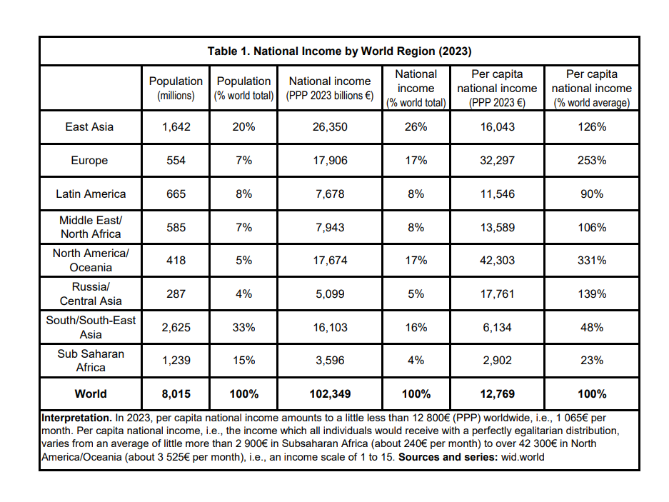
Source: WID Global Inequality Update 2024
This table presents population and national income figures by world region. According to Piketty, the term "national income" here corresponds to Net National Income (NNI) in national accounting:
NNI = GDP + net income transfers from abroad – capital depreciation.
Roughly speaking, it’s similar to GDP.
It’s also important to note that these figures are adjusted using Purchasing Power Parity (PPP), which eliminates distortions caused by currency fluctuations and differences in price levels across countries. For instance, if a loaf of bread costs 1 pound in the UK and 2 euros in France, and if the two loaves are of equal quality and size, we say that 1 pound has the same purchasing power as 2 euros. Thus, 1 GBP = 2 EUR is the PPP exchange rate. In practice, PPP is calculated using a representative basket of goods and services, not just one item.
The national income figures in this table are all expressed in euros using PPP-based exchange rates. This often narrows the income gap between rich and poor countries, because richer countries tend to have stronger currencies and higher price levels when compared using nominal exchange rates.
Now, let’s take a closer look at the data.
East Asia accounts for 20% of the world’s population (1.642 billion) and 26% of global national income (€26.35 trillion). This region includes China, Japan, South Korea, and Taiwan.
South and Southeast Asia is also of particular interest. It holds the largest share of global population at 33% (2.625 billion) and accounts for 16% of global income (€16.103 trillion).
This region—South and Southeast Asia—may see the most significant growth in both population and economy over the next 25 years.
If we sum the three Asian regions—East, Southeast, and South Asia—we get:
Population: 53% (4.267 billion)
National Income: 42% (€42.453 trillion)
That is already a dominant share of the global total.
On the other hand, “the West” can be roughly defined as North America + Oceania + Europe:
Population: 12% (972 million)
National Income: 34% (€35.58 trillion)
While it’s no surprise that Western populations are smaller than those of Asia, it is remarkable that their share of global income, once overwhelmingly dominant, is now being matched—and will likely be overtaken—by the East. The real center of the world economy has shifted to the eastern half of the Eurasian continent, and this trend is likely to continue.
Finally, let’s look at Sub-Saharan Africa. Despite having 15% of the world’s population (1.239 billion), it generates only 4% of global national income (€3.596 trillion)—the lowest per capita income of any region in the world. What’s more, its population is expected to nearly double by 2050, reaching 2.448 billion, according to UN projections. While it may be unrealistic to expect a sudden economic takeoff, we may witness a phase of rapid development in Sub-Saharan Africa in the latter half of the 21st century. It is undoubtedly a region to watch for the long term.